
Hôm nay mình sẽ share 1 số hiệu ứng hover button đẹp mà mình sưu tầm được. Hi vọng với những đoạn CSS này sẽ giúp cho website của các bạn trở nên lung linh hơn.
Demo các bạn có thể xem tại đây
Mình sẽ cập nhật thường xuyên, vì vậy các bạn có thể quay lại xem khi cần nhé.
Mẫu hover button style 1
Click me!Mình đặt class button là btn-hover

.btn-hover{
	position: relative;
    background-color: unset;
}
.btn-hover span{
	background-color: unset;
    position: relative;
}
.btn-hover:hover:before {
    width: 0;
}
.btn-hover:before{
    bottom: inherit;
    left: inherit;
    position: absolute;
    right: 0;
    top: 0;
    background: #f9c32f;
    content: "";
    height: 100%;
    width: 100%;
	transition: width .25s ease-in 0s;
}
.btn-hover:after {
    bottom: 0;
    left: 0;
    position: absolute;
    right: 0;
    top: 0;
    border: 2px solid #f9c32f;
    content: "";
}
Mẫu hover button style 2
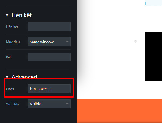
Click me!Mình đặt class button là btn-hover-2
.btn-hover-2:before{
	content: "";
  position: absolute;
  top: 0;
  right: 0;
  bottom: 0;
  left: 0;
  background-color: #717071;
  transform: translateY(-100%);
  transition: all 0.5s;
}
.btn-hover-2:hover {
  background-color: red!important;
  color: #fff;
}
.btn-hover-2:hover:before {
  transform: translateY(110%);
}
.btn-hover-2{
	overflow: hidden;
}
Mẫu hover button style 3
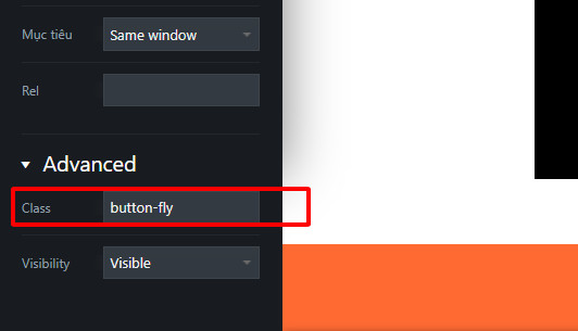
Click me!Mình đặt class button là button-fly
 .button-fly {
	 --background: #275efe;
	 --text: #fff;
	 --font-size: 16px;
	 --duration: 0.44s;
	 --move-hover: -4px;
	 --shadow: 0 2px 8px -1px rgba(39, 94, 254, .32);
	 --shadow-hover: 0 4px 20px -2px rgba(39, 94, 254, .5);
	 --font-shadow: var(--font-size);
	 box-shadow: var(--shadow);
	 transform: translateY(var(--y)) translateZ(0);
	 transition: transform var(--duration) ease, box-shadow var(--duration) ease;
}
 .button-fly div {
	 display: inline-flex;
	 overflow: hidden;
	 text-shadow: 0 var(--font-shadow) 0 var(--text);
	 justify-content: center;
	 height: 22px;
}
 .button-fly div span {
	 display: block;
	 backface-visibility: hidden;
	 font-style: normal;
	 transition: transform var(--duration) ease;
	 transform: translateY(var(--m)) translateZ(0);
}
 .button-fly div span:nth-child(1) {
	 transition-delay: 0.05s;
}
 .button-fly div span:nth-child(2) {
	 transition-delay: 0.1s;
}
 .button-fly div span:nth-child(3) {
	 transition-delay: 0.15s;
}
 .button-fly div span:nth-child(4) {
	 transition-delay: 0.2s;
}
 .button-fly div span:nth-child(5) {
	 transition-delay: 0.25s;
}
 .button-fly div span:nth-child(6) {
	 transition-delay: 0.3s;
}
 .button-fly div span:nth-child(7) {
	 transition-delay: 0.35s;
}
 .button-fly div span:nth-child(8) {
	 transition-delay: 0.4s;
}
 .button-fly div span:nth-child(9) {
	 transition-delay: 0.45s;
}
 .button-fly div span:nth-child(10) {
	 transition-delay: 0.5s;
}
 .button-fly div span:nth-child(11) {
	 transition-delay: 0.55s;
}
 .button-fly:hover {
	 --y: var(--move-hover);
	 --shadow: var(--shadow-hover);
}
 .button-fly:hover span {
	 --m: calc(var(--font-size) * -1);
}
Thêm một chút js nữa là ổn.
<script>
		jQuery(document).ready(function($) {
			document.querySelectorAll('.button-fly').forEach(button => button.innerHTML = '<div><span>' + button.textContent.trim().split('').join('</span><span>') + '</span></div>');
		} );
</script>